
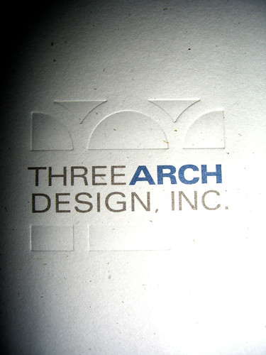
Here is the logo, two color with a deboss.
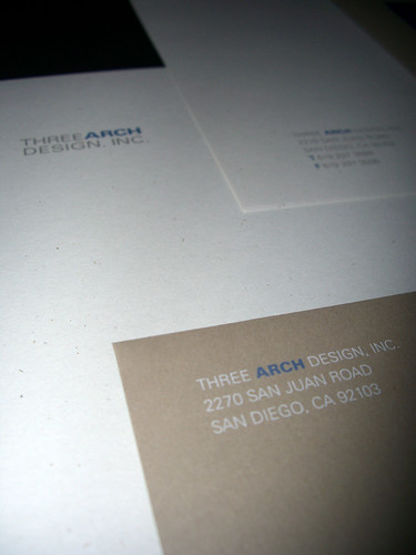
I love the paper he selected for the letterhead. I think the natural, hickory fleck adds another dimension to the piece.
Here is the bottom of the letterhead, the second sheet and the business envelope.
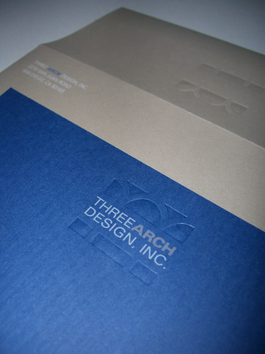
The next item is the correspondence note card with its envelope. Again, the paper selection brings the design to life. It has a vertical column texture that mimics the columns in the logo. Love it!
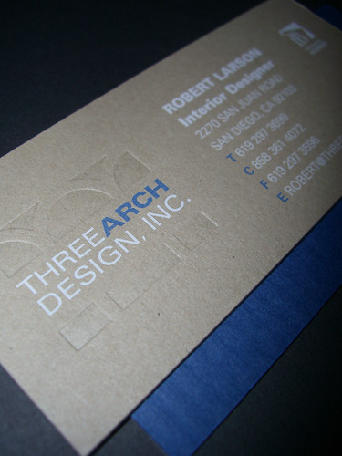
Finally, the business card is on the kraft brown cover stock and backed with the navy column fabulousness.
No comments:
Post a Comment